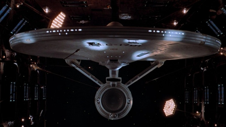
The name "USS Enterprise" has a long and storied history. Although two Enterprises briefly served the Colonial Forces and Continental Navy, the first true United States Navy vessel to bear the title came into service in 1799, followed by a schooner in 1831, a screw sloop-of-war in 1874, the 1938 Yorktown-class aircraft carrier that fought with distinction in World War II, and the first nuclear-powered aircraft carrier in 1961. But barely three years after that last ship was commissioned, Gene Roddenberry gave the name to a fictional spacecraft: the Federation starship USS Enterprise NCC-1701.
Prior to the original Enterprise boldly going to NBC in September 1966, you'd be hard-pressed to find a spaceship in film or on television that didn't look like a rocket, a flying saucer, or something cobbled together out of commercial model kits. Two years before "2001: A Space Odyssey" debuted, the starship Enterprise broke the mold, and science fiction hasn't been the same since.
The Star Trek spinoffs and reboots that arrived in the intervening decades have introduced many other starships named Enterprise, but how do they all stack up? Starships are more than a pretty face, so ranking them must take into account their demonstrated on-screen performance and special features in addition to their visual appeal. With that criteria in mind, here are all the main starships named Enterprise, ranked.
Enterprise J: Universe-Class Pizza Cutter
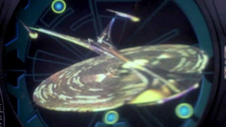
Although this list won't include every Enterprise glimpsed in one-off alternate timelines, one deserves a mention because the episode in which it appears suggests that it's from a future that a hostile force wishes to prevent from happening, so we might assume that it's the timeline that's supposed to occur. That ship would be the 26th century's NCC-1701-J, which features briefly in the "Star Trek: Enterprise" episode "Azati Prime." That's the one where Captain Archer is shown a history-defining battle in order to convince him to change his course of action.
We see almost nothing of this ship — just a corridor and a window looking out on a swath of her underbelly. As the most briefly seen of all the Enterprises, we have effectively zero information about her capabilities, other than the fact that she fires beams that we presume are phasers. Our only on-screen clue to her overall configuration is a diagram that appears on a screen; from that, one can surmise that this supposed Universe-class starship is awkward and ugly, looking like it's been flattened by a steamroller a la Judge Doom in "Who Framed Roger Rabbit?" For all these reasons, she can only land in last place.
Enterprise 1701-B: The Hybrid
Throughout the first four seasons of "The Next Generation," a display in the Enterprise-D's observation lounge featured six vessels, each one representing a different Enterprise. Amongst these were an Excelsior-type ship that was presumably the 1701-B. However, it wasn't until 1994 and the film "Star Trek: Generations" that the B would actually appear on screen.
The 1701-B's single outing is brief and figuring out her capabilities is mere guesswork, as her cruise, already nothing more than a publicity stunt, is interrupted by an actual emergency for which the not-quite-fully outfitted vessel is ill-prepared.
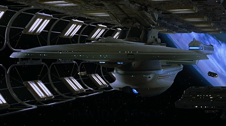
What we can judge is the ship's appearance. We see next to nothing of the B's interiors, and the exterior is simply the USS Excelsior model with a few fresh modifications. In an attempt to make the Enterprise-B something new, the existing miniature had extra bits glommed on, most notably a pair of oversized impulse engine blisters that bracket the already large impulse deck, both foolishly aimed at the warp nacelles. Worse, to add something to the ship that could be visibly damaged without harming the model, a flared beltline was added to the B's hull, which utterly destroys the lines of the ship.
Enterprise 1701-C: The Compromised Class
The aforementioned display on the Enterprise-D suggested that the 1701-C would look like something between the Excelsior-class ship and the Galaxy-class Enterprise. In fact, as "The Next Generation" season 1 consulting senior illustrator Andrew Probert told Star Trek Futures, if he'd had his way, we would have seen a ship of the C's class (which he dubbed "Ambassador-class") appear as the USS Fearless in the episode "Where No One Has Gone Before." Probert was overruled, however, and stock footage of the Excelsior model was used instead.
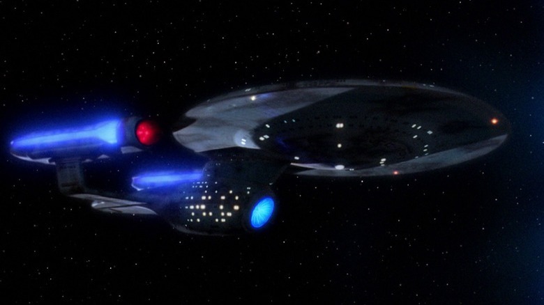
When the 1701-C finally appeared in the third season episode "Yesterday's Enterprise," she wasn't quite the ship that Probert had imagined. In a rush to get a miniature built quickly, the ship's design was greatly simplified, and the engineering hull's compound curves eliminated for expediency. The result looks less like a progression from the B to the D, and more like it belongs between the A and the B.
Given how utterly beat up she is upon popping out of the space anomaly of the week, and since she's destined to be destroyed in order to set history straight, it's difficult to gauge the ship's capabilities. Again, that design is really all we have to go on.
Enterprise 1701-A: The Changeling
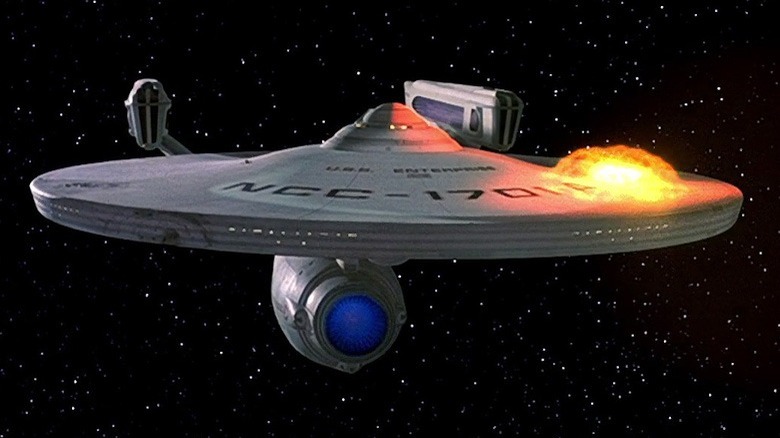
After the scuttling of the refit Enterprise in "Star Trek III: The Search for Spock," many fans expected that the replacement ship would be the "great experiment" known as the USS Excelsior, with her transwarp drive. The very end of "Star Trek IV: The Voyage Home" plays on that expectation, showing the Enterprise crew heading towards the Excelsior before pulling a gotcha and revealing an Enterprise identical to her late predecessor in every way but her registry: NCC-1701-A.
However, "Star Trek V: The Final Frontier," which is often considered one of the worst films in the series, demonstrated that the A was a lemon and a joke. It was only in its sequel, "Star Trek VI: The Undiscovered Country," that her capabilities were demonstrated and her reputation redeemed.
The ship's interiors change drastically between the two films. The A has a "The Next Generation"-like aesthetic in "The Final Frontier," and feels like a cramped warship in "The Undiscovered Country." They're basically different ships. A mix of new sets and standing sets then in use for "The Next Generation" resulted in the mismatch; such inconsistencies in both performance and design merit her less than stellar position here.
Enterprise NX-01: The Early Bird
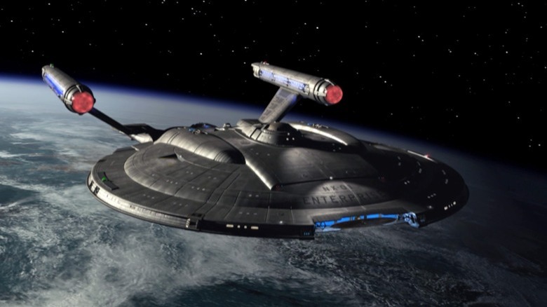
Unlike the other Enterprises discussed here, the NX-01's name was not preceded by the letters USS (United Space Ship), but that's not enough to leave her off this list.
If we were merely ranking these starships by their technological sophistication, the "Star Trek: Enterprise" flagship would land squarely at the bottom, being a veritable antique. Comparing her to even the original NCC-1701 would be like comparing the first Navy flattop to a modern supercarrier. However, taking into account the time in which the ship was built and the fact that she's merely a prototype, Captain Archer's Enterprise more than distinguishes herself.
As repeatedly demonstrated in the series' four seasons, the first Starfleet ship named Enterprise was tough and capable. Her interior detailing rests comfortably and logically between NASA's design sense and that of the Federation. The ship's exterior design isn't quite as good, and she doesn't have as many good angles as most of her fellow Enterprises. In addition, like the E, she suffers from looking terrible in profile, with an undistinguished silhouette.
Enterprise 1701-E: The Borg Buster
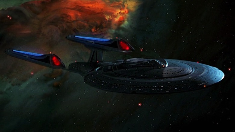
Following the ignominious destruction of the D in "Star Trek: Generations" and the trashing of the Enterprise's main bridge set for that film, a new ship had to be built for "Star Trek: First Contact." The result was the Sovereign-class Enterprise 1701-E, which would go on to star in "Star Trek: Insurrection" and "Star Trek: Nemesis."
In her three cinematic adventures, the E performs admirably, and avoids getting completely blown to bits despite facing vessels vastly more powerful and more numerous. "First Contact" features a lot of action, but, as is ever the case of the movie Enterprises, we never really get to see her function as an exploration vessel.
Appropriately, the ship's interiors eschew the hotel-like aspects of her predecessor in favor of a harder, less comfortable look. Externally, she was designed to look leaner and meaner than any other Enterprise, with angles and swept back elements suggesting a forward momentum. The result is a ship that looks great from above, behind, and a few other angles, but ungainly in others — her profile suggests that she's been stepped on. The design also suffers from one of the B's flaws: oversized impulse engines whose exhaust ports point too close to the warp nacelles.
Enterprise 1701: Kelvin Times
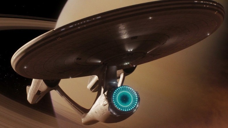
While it's supposedly the same ship each time, the Enterprise looks somewhat different in all three of the Kelvin timeline films (2009's "Star Trek," "Star Trek Into Darkness," and "Star Trek Beyond"); the "Beyond" variant in particular is a rather extensive overhaul. How much you like any of these rests on how big a fan of "ample nacelles" you are, but as a cohesive design they're all a bit of a miss, with a saucer section that appears mismatched with the rest of the ship, an engineering hull that's too far forward, and nacelles that are too close together.
On the other hand, the interiors are gorgeous and roomy with plenty of points of visual interest. You might hate the brewery-like engineering spaces featured in the first film and think the bridge looks like an Apple Store (it doesn't), but the designs are fantastic. overall.
How good this Enterprise is as a functioning starship remains questionable, however, as she gets thrashed repeatedly in all three films, and is ultimately chopped to bits and replaced by a briefly glimpsed A of her own in the closing moments of "Beyond."
Pike's Enterprise 1701: Strange New Starship
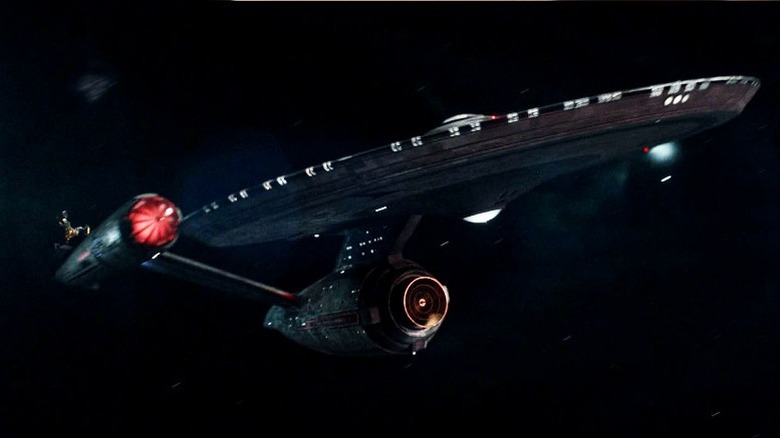
"Strange New Worlds" revised the Pike-era Enterprise NCC-1701, which was first introduced in its current form on "Star Trek: Discovery." That ship had a thankless job: It needed to satisfy old school fans, who expected a ship that honored the original '60s model, while also featuring a more modern design to satiate newer viewers. As such, she harkens back to both the Enterprise of "The Original Series" and the refitted version from "The Motion Picture." The spinning nacelle caps and copper deflector dish come from the former, and the swept back pylons and glowing engine grills recall the latter. She's a handsome ship both inside and out, with detailed, roomy interiors that rank up there with the Kelvin timeline's Enterprise in terms of design and visual appeal.
Sadly, Pike's vessel seems to have a glass jaw, getting repeatedly beaten up in the first season. Her reach is apparently worse than an old U.S. Navy battleship's, too, as objects that are visible in the same shot are somehow "out of weapons range." Season two of "Strange New Worlds" should clarify how good of a ship this Enterprise ultimately is. Let's hope she learns how to take a punch.
The Refit Enterprise 1701: The Pearlescent Beauty
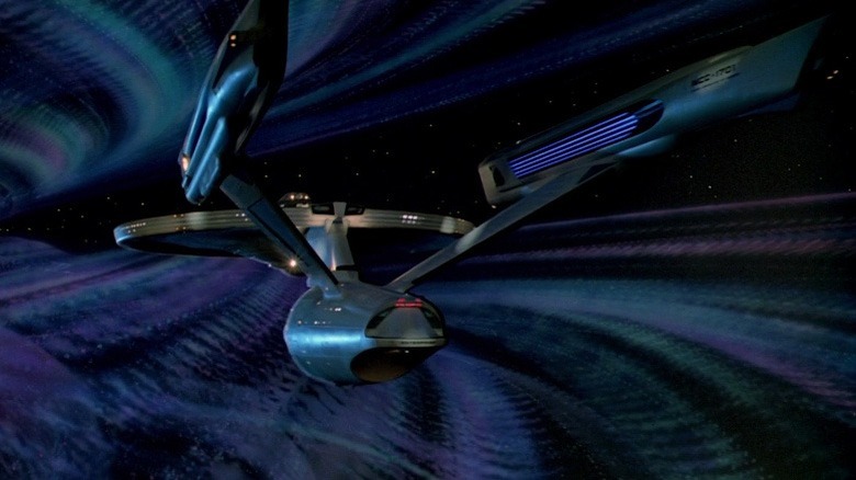
The redesigned Enterprise from "Star Trek: The Motion Picture" is, in a word, gorgeous. From her subtle curves and art deco influences to her spectacular pearlescent finish, she's a great looking ship.
Sadly, she doesn't age gracefully in the two following films. She's scarred in "Star Trek II: The Wrath of Khan," and is inexplicably even more battered at the beginning of "Star Trek III: The Search for Spock." That "Motion Picture" shine literally fades away to a flatter look throughout the second film, likely because of a change in visual effects companies and a dulling down of her paintjob. By the third film she's lost her luster, and then she's blown to smithereens.
Still by the end of that first movie, the refit ship feels ready for any adventure. Her shields are capable of withstanding the V'ger energy bolts that chew up Klingon ships in seconds, and she can torpedo mountain-sized asteroids into rubble with a single shot. Her capabilities diminish in the next two installments, though; were she not treated like a tired old punching bag in those films, she'd be number two on this list.
Enterprise 1701-D: The Galaxy Class Swoop
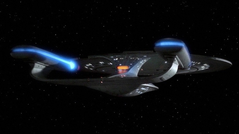
Fans are sharply divided on the Galaxy-class NCC-1701-D. Some think she's awkward and ungainly, while others argue that she's the embodiment of "technology unchained." The D stands out among other Enterprises like a Luigi Colani car in a parking lot full of Toyotas: If nothing else, it's distinctive. Of all Enterprises, she's the most carefully thought out in terms of features, from her transporter emitters to her escape pods to her ability to split into two independent vehicles.
One problem with ranking this ship's visual appeal is that the two main models used to portray it are fairly dissimilar, with the smaller one making it look like the ship has been binging Cheetos. The original 6-foot miniature is an A+, but the fatter 4-footer is a B-. Whichever model you're looking at, however, the main visual sin this Enterprise commits is a saucer that's so big that it can entirely hide the rest of the ship, making high forward angles a no-no. The ship's interiors are a mixed bag, too — some fans complain that it feels too much like a hotel or a cruise ship, and not an interstellar vessel built to boldly go into the final frontier.
Enterprise 1701: The Original
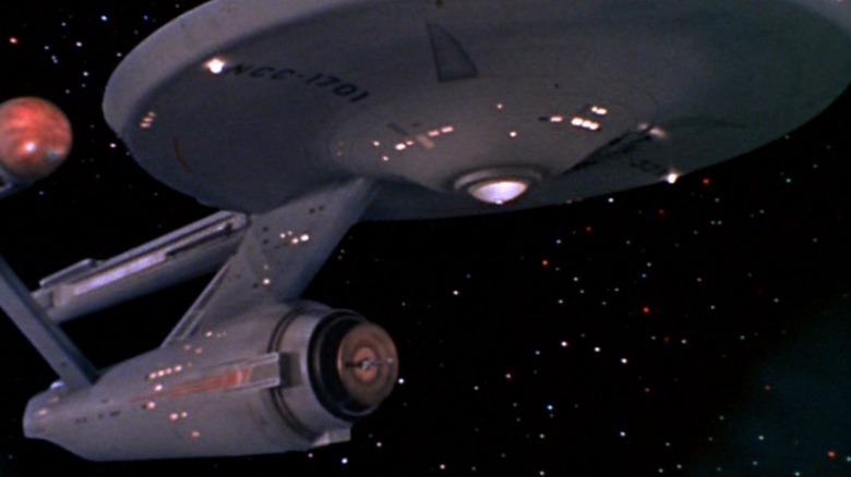
Polls indicate that "The Original Series" is still the most popular Star Trek show. Accordingly, the OG USS Enterprise belongs at the top of this list.
Despite her vintage, the original 1701 is a badass. She always manages to go faster than she's designed to without flying apart. She's capable of glassing a planet's surface ("A Taste of Armageddon"), and blowing an unshielded starship to dust with a single phaser blast ("Day of the Dove"). She survives galaxy-enveloping energy barriers and antimatter-spewing planet killers, and always comes out on top.
Visually, interiors are her weak point, even making allowances for a '60s series. Outside of the bridge, the cabins, and engineering, too many corridors and compartments are visually flat and feel unlived in. Externally, she might look simple to audiences accustomed to heavily textured hulls with complex curvatures, but the genius of her design is in her simplicity; she combines familiar icons of space travel — rockets and flying saucers — in a fashion that instantly tells you that not only is this is a spacecraft, but it's one intended to operate entirely outside of the confines of atmosphere and gravity. That, along with a paint job that resembles a Navy cruiser, communicates what she is at a glance. That's brilliant, and why the original Enterprise is still number one.
Read this next: Every Star Trek Show And Movie In Chronological Order
The post Every version of the USS Enterprise ranked worst to best appeared first on /Film.
0 Commentaires